
The number of people who access web content from their portable devices is growing every single day. In fact, number of mobile users have now exceeded over 1 billion people worldwide, and even overtook desktop usage for the first time in 2015.
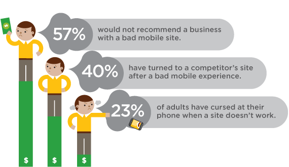
This, along with the roll out of Google’s brand new algorithm that penalises non-mobile-friendly sites, means that there has never been a more critical time to make your website mobile friendly. But, how do you go about this? Using the steps below is a pretty good place to start.
Can you read it?
On a mobile device, text is much smaller than when on a desktop monitor. So, to be mobile friendly, text needs to be readable on mobile devices. Pretty simple, right? It is generally seen that the optimum size for mobile usability is anything that exceeds size 14.
Testing, testing
Though they may be penalising the websites that aren’t mobile friendly, Google is actually here to help you, so make sure you’re using the free tools they offer.
Google’s Mobile Friendly Test Tool provides you with everything you need to see how your site is doing, and, Google will even offer you a huge number of handy tips to boost your mobile usability score, for free! How cool is that?! Test your site yourself too. Take a look from your own mobile and try to use it as though you were looking at it for the first time. Change anything you don’t like!
Mobile Version
Don’t want to simplify your awesome site on desktop just to make it better for mobile users? Then create a mobile version of your site! Running parallel to your desktop site, this way you give users the option to choose between a mobile version or desktop version when accessing your site from their phone or tablet. We also recommend using a heatmap software tool to focus on elements that get the most interaction on your site, to optimize for conversions.
Links
One of the issues that I myself have run into in the past, is links being too close together to work on mobile. On mobile, navigation is different. The user is not using a mouse and a cursor, they are using their own finger. This means that the links they click on to navigate through your site – or any other clickable content – must be far enough apart to be clicked on efficiently with a finger or thumb.
Contact details on the go
It is worth remembering that a majority of people on your site on mobile are on-the-go. Try to put yourselves in the shoes of the user – what information will they be looking for? Usually, the answer to this question is contact details or opening times. Make sure the information that your users will want when accessing your site via mobile, is readily available to them!
Scale down
Big images look great on desktop, but can have some really tricky implications on mobile. Big images tend to take longer to load, and can slow your page speed down massively. Not only are slow pages bad for SEO, they are also really bad for user experience. Using smaller versions of your images is a great way to combat this issue.
These are only a few of the hundreds of different things you can do to make your website more mobile friendly. A quick web search for “How To Make Your Site Mobile Friendly 2015,” will bring up pages and pages of useful tips and guides of the most up to date information for you to work through.
Do you have any tips not mentioned here? What are your favourites?